Plotting Stock Correlations in Stator and D3.js
In this tutorial I am going to design a visualisation of stock price correlations in Stator using the D3.js visualisation library. This visual study will be highly interactive allowing you to view correlations at any point in time along with the ability to view the complete correlation path for the time period being analysed.
So let’s get to it-
What do I need?
You need the latest version of Stator which includes visual studies functionality, if you haven’t already installed Stator then visit the download page to get started, it’s an easy installation. You will also need access to security price data which you can connect to using one of our many (free) data plugins.
For those of you that are unfamiliar with Stator, it’s leading portfolio management software designed for the financial markets and used by professional traders, retail traders and hedge funds all around the world. D3, which is the visualisation library we’ll be using is a leading JavaScript library that supports dynamic and interactive data visualisations. These two technologies combined enable you to analyse financial data in ways never before imagined– all via functionality known as “Visual Studies”.
For more information regarding D3.js please click here.
Correlation, what is it?
In the world of finance, a correlation is a statistical measure of how two securities move in relation to one another. Correlation is computed into what’s known as a “correlation coefficient” which ranges between -1 and 1. A correlation coefficient of 1 simply means as one security moves up or down the other will move in exactly the same direction. A correlation coefficient of -1 means as one security moves up or down the other will move in the opposite direction. A value of 0 means the two securities more without any relation to one another, they are said to move randomly.
As a general rule:
- Coefficient = 1 = same movement in prices observed
- Coefficient = 0 = no relationship between price movement
- Coefficient = -1 = opposite movement in prices observed
Calculating the correlation coefficient
For the purposes of this visualisation I am going to calculate the “Pearson’s Correlation” between each of the selected securities. “Pearson’s Correlation” benchmarks the linear relationship whilst another commonly used correlation “Spearman’s” benchmarks monotonic relationship. As this visualisation looks at the linear relationship between security prices we will use “Pearson’s Correlation”.
Calculating the correlation manually isn’t difficult, just tedious if the data set is large. Later in this tutorial we’ll code a generic correlation function to handle the computation.
The formula to calculate the “Pearson’s Correlation Coefficient” is:
x = security 1 average closing price
y = security 2 average closing price
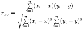
To calculate the “Pearson’s Correlation Coefficient” in a single pass you can use the following formula.
For the purposes of this visualisation, the “Pearson’s Correlation Coefficient” will be calculated using a moving average of the closing price. This will provide a more stable correlation over time as the primary purpose is to identify trends in the movement of correlation.
The steps to calculate the “Pearson’s Correlation” for two securities in our visualisation is as follows:
- Calculate the mean (average) of x and y
- Subtract the mean of x from every x value (call it “a“), the same for y (call it “b“)
- Calculate a x b, a2 and b2 for every value
- Sum a x b, sum a2, sum b2
- Divide the sum of a x b by the square root of ((sum of a2) x (sum of b2))
Are you still with me?
This calculation will result in a value between -1 and 1 and repeating this calculation for each date in the data period will generate a correlation-time series which we can plot in addition to a single correlation calculation. This will become more evident as we advance further into the tutorial.
What key design elements do we want for this visualisation?
One key feature of this visualisation will be “interactivity”. Allowing the user to observe changes in correlation over time will help to tell a story and hopefully it will highlight trends which may influence future investment decisions. Ideally, we’d like to make the process of viewing correlation changes over time as user-friendly as possible which can achieve using a simple “mouseover” effect as shown in the image below:
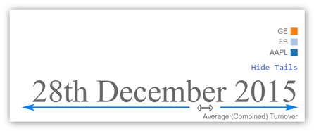
As the user moves the mouse cursor from left to right over the date area, the underlying date will change forcing the visualisation to refresh and thus updating the plot of security correlations.
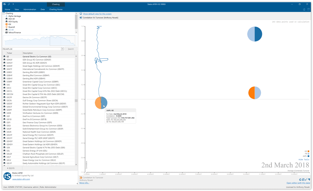
Another feature we’ll develop for this visualisation is the ability to view an entire correlation path (correlation-time series). We’ll allow the user to toggle path visibility for all correlations or just a single correlation. The image shown below illustrates how a single security pair correlation is overlaid onto the visualisation as the mouse cursor is positioned over the security correlation circle.
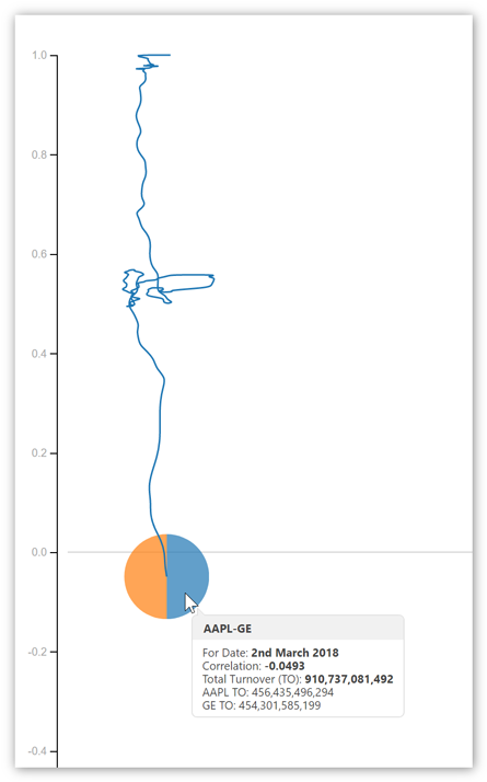
So what exactly are we seeing in the picture above?
It’s the correlation over time of two securities, GE and Apple Inc. The end date of this analysis is the 2nd of March 2018 and we can clearly see how the correlation has changed from near 1.0 at the start of the study (June 2013) to -0.0493 in March 2018. It’s telling us that GE and Apple Inc are no longer correlated- but they once were!
Another important feature that needs to be mentioned here is the ability to calculate and plot correlations for multiple securities. What we want to do is allow the user to select multiple (any number of) securities using their mouse, all of which will have correlations calculated and plotted. The visualisation will determine all the possible security pairings and will calculate and display correlations accordingly. Sounds impressive doesn’t it?
It’s also important to note that any visual studies which you write for Stator should be dynamic in their ability to handle data with differing ranges. That is, the data accessed by a visual study will maintain the same format with different ranges. For this reason a visual study needs to dynamically recalculate scales each time the study is refreshed or new data added.
Cleansing the underlying data
Data for this visual studies ‘data domain’ is in the following JSON format:
Immediately we see the “DateTime” field is represented by a string which isn’t code friendly. Ideally, we need to convert this date field into a JavaScript “Date” object which we accomplish using the code snippet shown below. The code cycles through each date in the JSON file and parses the date portion into a JavaScript “Date” object. Extra processing is performed to determine the minimum and maximum dates in the data file which are used to dynamically calculate scales etc.
Utility functions
This visualisation relies on a lot of calculations being performed on the underlying data. To avoid code duplication we’ve written a few utility functions/methods which have single or limited scope of responsibility. Code reuse is an important aspect of smart programming and shown below are a few of the utility functions which are used in this visualisation.
A date in plain English
You’ve may have noticed the nice English representation of date in this visualisation, that is, the 1/1/2018 is written as “1st January 2018”. This is achieved using the utility function shown below. It takes a JavaScript “Date” object as an input parameter and returns an English string representation of the date.
Calculating correlation coefficient
Credit to Steve Gardner for writing this correlation coefficient function in JavaScript. The function takes two array input parameters and returns the Pearson’s Correlation Coefficient. You’ll notice the function has a ‘protective’ “if” clause to warn the user if the two input arrays are not of the same length (size). As you’ll see by reviewing the full visualisation code we ensure the two input arrays have the same size before being passed to the correlation function.
Calculating an average (the mean)
The following utility function takes an array as an input parameter and returns the calculated mean.
Summary
So at this point you’re probably interested in seeing all the code working together. Without further hesitation please find the complete visual study “Correlation vs Turnover” shown below. This visual study is included when you download Stator and you’re free to edit and change the code to your own needs. Included with Stator is a fully integrated development environment (IDE) which you can use to test, write code and play with visual studies.
Shown in the image below is the complete visualisation. Three securities have been selected (General Electric, Facebook and Apple) which results in three correlation calculations (three possible pairings). The mouse cursor is positioned over one of the correlation plots which forces the visualisation to draw the entire correlation path. There is also an option to display all correlation paths which is toggled with a link.
Try it for yourself and let us know what interesting correlations you find!